

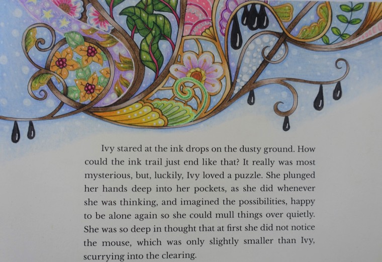
I recently got my hands on Johanna Basford’s new colouring book, Ivy and the Inky Butterfly. I always knew I had to get this book eventually but I didn’t preorder it. I have so many books to start that I was putting off this purchase. However, as soon as I saw others colourists work from this book I got online straight away to get a copy.
Unlike Johanna’s other colouring books this one is actually a storybook as well. This story was inspired by Johanna’s own little daughter, who the book was named after. It tells a magical tale of a little girl named Ivy, who finds a secret door that leads her to the land of Enchantia. As she chases an inky butterfly, she comes across many interesting characters and wondrous things along her journey. The story is very cute and imaginative. It is also quite long, so it’s probably not a bedtime story I can get through in one night with my toddler. This is in no way a negative, as it will keep me entertained as I am reading as I colour through this book. I’m sure by the time I finish it Octavia can read it to herself.
There are actually two versions of this book, the US and the UK. In Australia, the bookstores are only selling the UK edition and I figure that would be the best copy. I often noted that colouring books that have been printed for the US market never have a good paper as the original country. However, I found this book is an exception. Lucy from the blog Colouring in the Midst of Madness wrote the fantastic article Inky Butterfly: A Comparision between the UK and the US Editions (also see video). Based on her comparison I decided to purchase the US edition. Although both versions have high-quality paper, Lucy found that the “US paper is much easier to use pencils on and is less likely to bleed with water-based pens”. The other big noticeable difference is the cover. UK edition is white with gold foil detailing. The US edition is an off-white with gold foil and some mint green detailing. Both are pretty but I do prefer the splash of green on the cover.
Something else that is special about both versions of this colouring book is that the paper on the cover is ideal for colouring in. I don’t think I own any other colouring books that have been designed with this in mind. I will probably leave mine as is, but I have seen other colourists cover and they are all very unique and special.
I can only speak for the paper in my US edition. It has to be the best paper I have ever coloured on and is unique to this book. The paper has a bit of a shine and takes pencils very well. You don’t need to do much layering at all get to cover the white speckling in the paper, yet you can keep layering and the paper will take it. I think so far I have only done up to 7 layers and I could of keep adding. So far I have only coloured with Prismacolor pencils, black Faber-Castell Artist Pitt pen and gel pens. I think this paper would great most colouring materials, with the exception of alcohol markers. I have seen other colourist using other materials, such as Polychromos pencils, Staedtler Ergosoft pencils, Derwent Inktense pencils, Winsor and Newton Watercolor, soft pastels and more. Everyone seems to have fantastic results with all of their materials. Johannah has also included a testing page in the back if you want to try before you apply a certain art material to a page.
These are the first pages that I have completed this book. If it wasn’t so close to Christmas I would have loved to keep colouring through this book. However, I have many Christmas themed pages to do in my other books. These pages are in ordered by page rather than which order I coloured them.
I left this title page for quite a while and I wanted it to be special as it is an introduction to this book. I just couldn’t figure out what I wanted to do. I finally decided to do purple-blue gems beside gold sculptured design, with a black background. I originally was going to go in the colour around the centre circle, blending from black to turquoise but I decided to leave it. This is the only page I have used black Faber-Castell Artist Pitt pen. I didn’t colour with a black pencil underneath to protect the paper and I still had no bleed through.

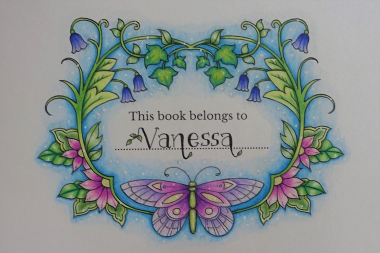
The name page is the first page I coloured in this book and was a bit of an experiment to see how I liked the paper. The colour went down beautifully and allowed me to blend to let every element shine on its own. I tried to write my own name like Johanna has done on the title page. I was going well until I had to go in with a black fine liner. I had my toddler in my bed tossing and turning and screaming in her sleep beside me in bed. I probably should have left it, but I was determined to get it done.
Before beginning Ivy in the Florist, I looked any many other colourist versions. Everyones was very different to what I envisioned. I imagined her inside the next door florist, being seen outside an elaborately designed door or window. I’m not sure I pulled it off as much as I liked, but I did enjoy layering the colour of the bronze window and vine ground. I did have trouble putting white gel pen over the stars. I never have much luck with white outlines.

The next page was Grandmother’s Strawberry Sponge Cake. This page reminded me more of a recipe book. I tried to make my strawberries seem a little 3D, which probably took me the longest to do. I am happy how they turned out. I decided not to add any background colour. To be honest I have yet to see any other version of this page where I thought the background colours complemented the strawberries. It may be that they look better in person or the red and greens are hard colours to match. I was happy to leave mine blank so that none of the elements got lost or washed out by other colours.

Grandfather’s wonderous items page one, is probably my least favourite at this point. I don’t dislike how I coloured it, rather I don’t like the colours I chose. Then again I did want it to look masculine and antique look to the items. I did go a little crazy with my white gen pen as the black outlines of the objects were just a bit too bold and strong. I decided to do a rough pencil background and I think it works better than a smoother finish.

I was nearly going to put this book down but then I saw this gorgeous video tutorial, Little Mouse by the very talented Chris Cheng. Although this picture is very small there was a fair amount of detail and layers that went into colouring it.
I’ve done a few of Chris’s tutorials and they all were exclusively Prismacolor Premier pencils and a white Uniball Signo pen. However, this tutorial also utilised coloured gel pens. I don’t often use gel pens and usually only at the end. This tutorial used gel pens over the top of white Signo and/or pencil, to cover some black lines and also to blend with the pencil for more depth. I’m not sure I had the same colours as required in the tutorial. My yellow pen was more of a Neon. I really liked the method of using gel pens to do the flowers, which was easy and effective. It was fun to try something new.

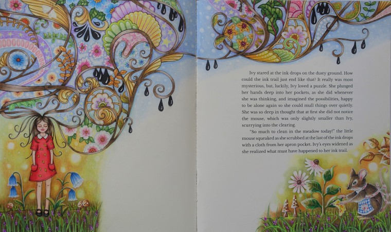
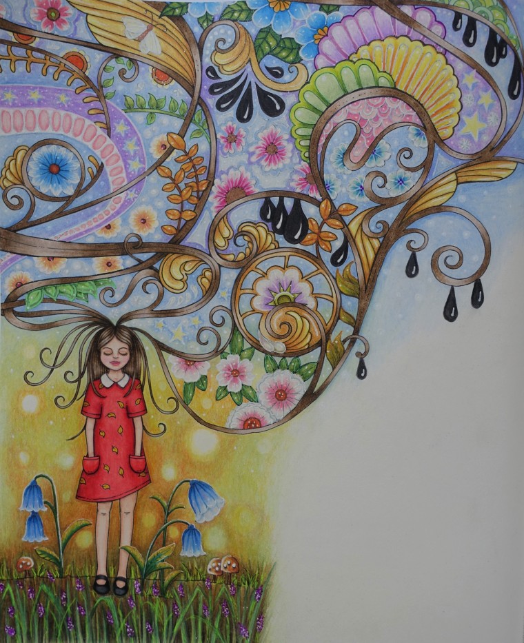
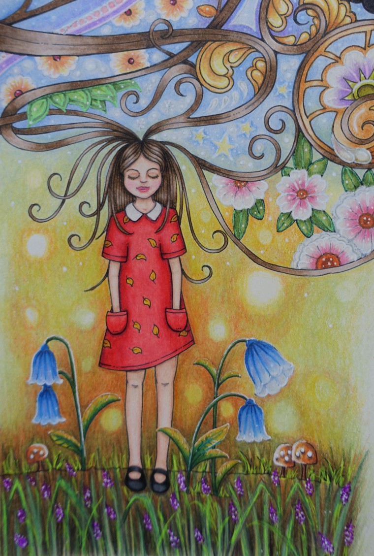
I decided to continue the adjacent page in a similar style to the Little Mouse. So I did the background in the same style. As for Ivy, I did her in the same colours I used previously in my book. This is definitely my favourite page. I used gel pens to enhance most of the flower and go over the black lines and they give a nice sparkle to the page.


I hope you enjoyed my tutorial and completed works. I’m sure I will be sharing new finished pages in the future. They will be shared in my Ivy and the Inky Butterfly gallery.
You can purchase the US and UK editions book from these retailers:
- Amazon (US edition)
- Amazon UK (UK and US edition)
- Amazon CA (US edition)
- Amazon DE (UK and US edition)
- Book Depository (UK and US edition)
- Australian retailers such as Myer, David Jones, Dymocks (UK edition)

I love the idea of a colouring book that has a story as well. Your completed pages are so pretty!
LikeLiked by 1 person
Thanks so much Kristah! I’m not usally a big fan of storybook colouring books, but this one is the except for me. Johanna definetely listens to colourist and has created something really special 🙂
LikeLike
Wow, you must be a very creative person; your choice of colours and colourings are beautiful. P.s “As she chases an inky butterfly, she comes across many interesting characters and wondrous things along her journey” ; surely an interesting story.
LikeLiked by 1 person
Thanks so much for you kind words Clare. It really is an adorable book. It would make a lovely present to yourself or a friend who likes to colour. I have to put this one down for a bit while I colour some wonderful Christmas scenes in other books 🎄
LikeLiked by 1 person
Ivy and the and inky butterfly I got my Adult coloring book
Before time
LikeLiked by 2 people
I hope your enjoying it Julie 😀
LikeLike
Hi! Love how you color the pages. Your favorite one is amazing. I would try to color a little bit more in this book!.
LikeLiked by 1 person
Thanks so much! I hope you enjoy this book. I currently have so many books on my table that this one is getting a bit neglected but I’m craving colouring in it since seeing your post 🙂
LikeLike
I know Love Adult coloring book by Johanna Basford her
The use for
LikeLiked by 1 person