

I have been admiring Tanya Bond’s Inkling colouring books series for a while. As soon as Christmas rolled around I had to add some of these books to my Christmas List. My mum was all too happy for me to buy something for myself on her behalf, so I purchased Inklings and Inklings 2 colouring books. This review is for the first and original colouring book in the Artist Edition.
Before I tell you about this book I will give you a bit of insight into the illustrator. Tanya Bond is a self-taught artist from the Irish Midlands. She has been painting professionally for several years and considers her art-style Pop Surrealism. She is known for her signature style of big-eyed girls with adorable companions. The amazing artworks she has created were turned into a colouring book via the KickStarter in 2015. After the success of that campaign, she continued to publish Inklings and then also published four more colouring books, Inklings 2, Astro-Zodiac, Mini-Inklings and Inklings 3.
The Inklings colouring book is an A4 size and includes 24 hand drawn illustrations. The front and back cover are in full colour and you get two larger images of her artwork (back cover is smaller). In the front and back inside covers, there are the full 24 coloured images of all the artworks that are included in the book. The picture below is from the inside covers. The covers are also soft and are stapled together with the rest of the pages.


There are two versions of her colouring books, the budget version and the artist edition. After reading others reviews of this book and the description on Tanya’s Etsy page, I decided to go with the artist edition. The paper in the both are a bright white, however, the artist edition is a 170gsm, whereas the budget version is 90gsm createspace paper (and is slightly smaller). I believe the artist edition can only be purchased directly from Tanya’s Etsy site. If you purchase from Amazon or Book Depository, you will receive the budget version.
The images inside the book are a great collection of her amazing artworks. There are fairies, pixies, mermaids and girls, and nearly all of which are accompanied by a cute animal companion. There is a variety of creatures, such as birds, bunnies and dragons. There is also a lot of variety in terms of positions of the girls, facial expression, size and style of hair. Some of the girls are dressed and presented in romantic renaissance style, some are modern and others are more mythical. All have big-eyes with a deep emotive expression, which looks straight from the paper and into your soul.
The line art of the illustrations is black and the thickness of the lines vary. There are a few pages with a blacked out background or section. The images are printed on both sides of the page, so you do have to be careful which mediums you use. I’m happy to tell you that this was not the case with Inkings 2. I will do a review of that book at a later date.
So my initial impressions of the book were that I loved it but it’s not exactly what I expected. I haven’t bought an artist published book before. All of my other colouring books are bound and most have hard covers or soft covers with a slip. Once I got over that fact I appreciated that it is different and that’s ok. I will have to take care of the cover, so it doesn’t get warn too much. The paper inside is lovely and thick and as I started colouring it I really appreciated the quality that was chosen for this book.
Another thing that did bother me initially was that some of the line art was so dark and thick. However, once I started colouring in this book I realised that it didn’t matter. I have been able to easier colour over the top of these lines and others I have just gone over with a white Posca to lighten up the picture.
What I love about this book are the gorgeous girls. They are so whimsical and pretty, realistic yet ethereal. I also love that there is so much variety to colour and that the line art is from finished pieces by the artist. I like to use the original artwork as a reference when colouring. I like to see where the shading and light need to go and how the image looks coloured. So it’s up to the colourist whether they use the image to colour it the same way, get some tips or just change it completely.
Below are my completed coloured pages from this book. I really enjoyed colouring every one of them. I honestly recommend this book if you are a fan of Tanya’s work or just love colouring whimsical girls and fantasy.
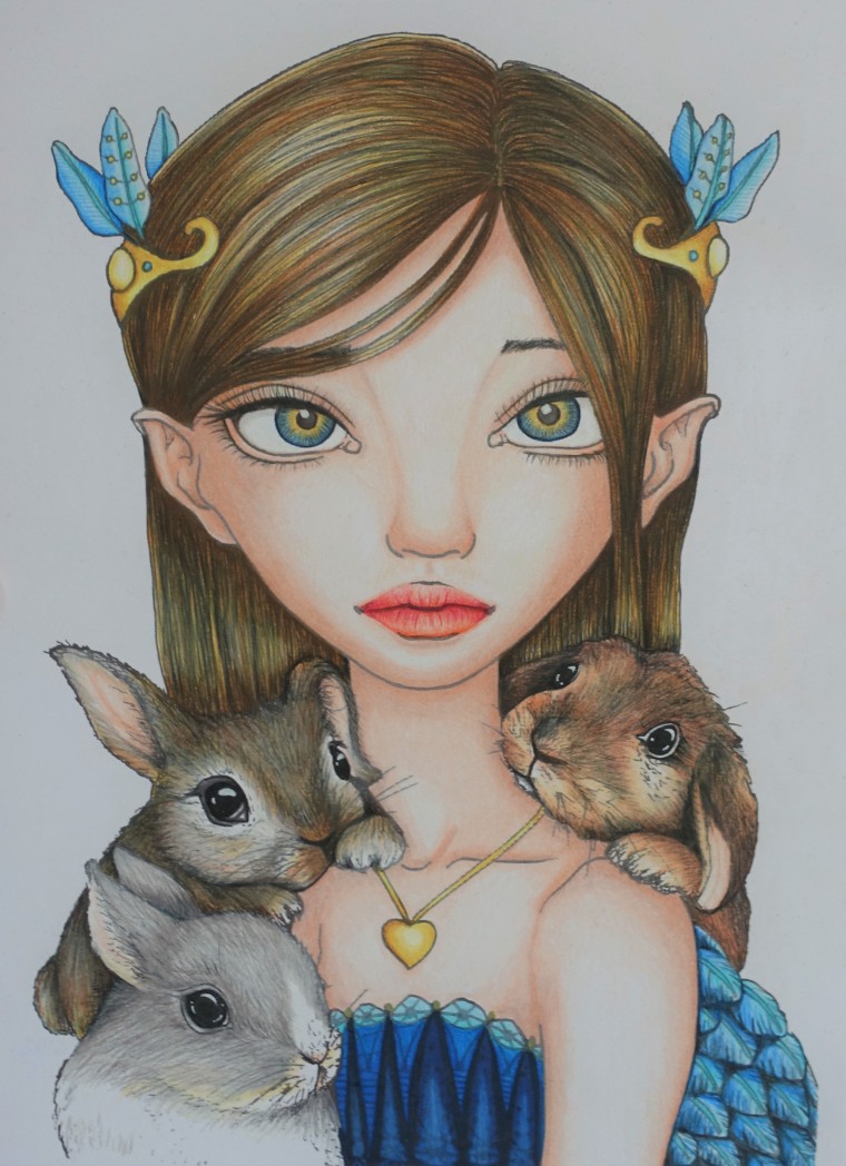
I decided to follow Chris Cheng’s tutorial, Bunny Keeper for my first page in this book. I have long been admiring this particular picture on Chris’s Instagram and I was eager to try out her techniques in this book. Her version is a bit more vibrant then the original artwork, which also has a background.
This tutorial is in three videos. The first video uses pastels and Prismacolor Premier pencils to do the skin and hair. I decided to use exclusively pencils instead and those colours were listed in the comments section so I didn’t need to figure them out. I was extremely happy with the result. The second tutorial was for the eyes and mouth and the third video was to do colour the bunnies. The bunnies probably took me the longest, as so many layers were required to get a realistic look. As for the dress and accessories, there were no tutorials for those. I decided to go with the same colours Chris probably used since I really liked the blue, turquoise and gold and I thought this was the perfect combination for this picture. I only used a little bit of white Posca pen for all the eyes. I love this one and learned a lot from Chris’s technique.
The next picture I did was the Hummingbird Whisper. The original artwork uses a lot of white, grey, and brown. I wanted the colours of mine to reflect the Ruby-throat hummingbird. So after colouring the hummingbirds, I used the same colours and some contrasting yellow and duller greens to fill in the rest of the plant life and background.
For the girl’s skin, I used the same coloured pencils, as Chris Cheng for the video tutorial, Princess Phoebe (from another page in this book). For her hair, I only really used three pencils and I use tried to do a lot of layers to create a realistic looking hair. I gave her striking grey-green eyes and dark flesh lips.
I used Prismacolor Premier pencils and a bit of white Posca pen to detail highlights and cover the dark black lines. I had to use quite a fair bit of Posca to cover the terrible pencil dots that covered the background from pencil dust. I love Prismacolor but I hate pencil dust.
I am overall happy with this picture, I just wish I didn’t go in so heavy when outlining her nose. I also found colouring the skin a bit challenging to get an even colour.

The Queen of Dragons was my next project. My daughter is really into dragons right now so I wanted to do something she would like. I wanted mine to be a bit more colourful than the original artwork.
I switched to Faber-Castell Polychromos pencils to see how they would look on this paper. I quite enjoyed these pencils on this paper. I also used a white Posca pen for the stars and other highlights. The background was already black on the paper. I found it much easier to do the skin with Polychromos pencils then Prismacolor. I did use a touch of white Prismacolor pencil to blend a little. I was unsure what to with the background since it was hard to figure out what it was without colour. I think I coloured it correctly though. I’m very happy with this one, especially the eyes.

For the Catterfly Keeper, I wanted to lighten up the picture and uses softer colours. I did reference the original artwork to work out where to shading, which really helped with the skin. I wanted to give the girl lavender hair, so she looked ethereal and to try something new. I only used purple, blue, cold grey and white to achieve it. For the cat, I did a lot of layers of greys with white and then went over with white Posca pen. The background for this picture also confused me. I have no idea what kind of crop it was so I tried the best I could to bring it to life.
The materials I used was Prismacolor Premier, Prismacolor Verithin pencils and white Posca pen. I have a done a review for the Verithin pencils in my next post. That will explain in a bit more detail how I use them in combination with Premier pencils. I love how the girl and cat turned out. I’m not sure they suit the background they were given since they look like they belong in a forest.

The last picture I coloured in this book so far is The Werewolf Queen. I wasn’t too crazy about this picture (original) but I really wanted to try one of the renaissances styled images in the book. This is definitely my favourite now. She is just so pretty.
I did use similar colours to the originals but without the white stripes. I also gave her extra gold beading and golden brown hair. I used Faber-Castell Polychromos pencils, white Prismacolor, Prismacolor colorless blender (for background), white Posca pen and gold Uniball gel pen.

I hope you enjoyed reading my book review of Tanya Bond’s Inklings. If you would like to purchase this book you can find it from the stores below. Again only the Etsy store sells the Artist Edition. The other retailers sell the budget version on thinner paper.

Very nice
LikeLiked by 1 person
Thank you 😀
LikeLike
You are welcome dear
LikeLiked by 1 person
So pretty these pictures look. I love to sketch and color too. I am loving your color choice here.
LikeLiked by 1 person
Thanks so much Neha. I’m not a huge fan of the original colour schemes. I like bright vibrant colours. You should try your hand at colouring. There’s a huge community of us that share our work and it’s a fun way to make something beautiful and connect with others.
LikeLiked by 1 person